Power of Responsive Web Design for website owners
Responsive web design is a technique deployed to make a website layout adapt to the size of the device or screen on which it is being viewed. This created a consistent experience for users across different devices, such as desktop computers, tablets, and smartphones. It is achieved through the use of web programming which adjusts the layout of a website based on the dimensions of the screen.
A responsive website can adapt to the various screen sizes and resolutions of different devices, rather than creating separate sites for each device which is costly to build. Using this technique, only one website is able to handle all the different devices viewing it. It is becoming increasingly important as more people access the internet on their mobile devices than using desktops.
The most important factor why websites are responsive is to ensure that the user experience is outstanding when they are interacting with websites. Having a responsive website reduced bounce rate and increased average time on page. These are two of the many metrics used to measure user experience by search engines such as Google rank our websites.
For us as a web design company, we wanted our clients to be satisfied with our designs when websites have a higher level of user engagement and they spend longer time on the websites. To owners of websites, it will result in higher rates of conversions.
Having a responsive website also helps websites to be friendly to Google crawler which uses mobile first indexing to index websites.
Top internet users are mobile users
According to statscouter.com, mobile users are the number 1 users accessing the internet. This trend shows that mobile usage will become more prevalent than using desktops to access the internet.
Why is this information important? In order for your services to attract clients, your website has to be suited for mobile users as well as desktop users. Hence, your website needs to have the correct sizing and font size to fit a mobile device, among other things, so that your clients can have a pleasant experience visiting the website.


Googlebot will give priority to mobile websites
Mobile First Indexing
One of the most important reasons why a website must be responsive is that before 2019, Googlebot indexes a website by crawling the desktop version of a website. But after July 2019, the mobile first indexing will be the default indexing by Googlebot when it starts to index new websites.
For a website to be relevant in the Search Engine Result Pages from Google, one of the criteria has to be mobile responsive. That means websites that are not mobile responsive may not rank well by search engines.
Furthermore, Core Web Vitals under Google Search Console is also one of the important changes in 2021 that will affect website ranking. One of the measurements is to measure the responsiveness of a website.
Core Web Vitals & User Experience (UX)
Core Web Vitals is one of the Page Experience signals by Google where users’ page experience is measured using 4 ranking signals. The 3 signals are Mobile Friendly, HTTPS and No Intrusive Interstitials.
The Core Web Vital can be found in one of the reports under Google Search Console where it will allow webmasters to understand how the website performs in specific to the user's experience engaging with a website.
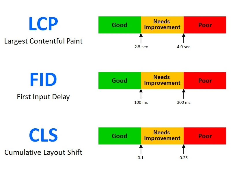
The Core Web Vitals measure the performance of websites that will have a significant impact on users’ satisfaction and engagement. It uses 3 parameters, the Largest Contentful Paint (LCP), First Input Delay (FID) and Cumulative Layout Shift (CLS) to measure user experience. More detailed information can be found in the SEO section of our website.
Building a responsive website using WordPress where it is faster loading and being mobile friendly will have a positive impact on these measurements.

User's Page Experience
> 55% users are on mobile devices to access internet
Google Mobile First Indexing
Example of responsive web design layout
Example of fixed or static web design
- Fixed Layout: The layout of a fixed website remains constant and does not change.
- Static Widths: Content areas fixed widths specified in the design.
- Very poor user experience: Frustrates the modern mobile users.
- Limited Mobile Optimization: Fixed websites are not optimized for mobile devices.
- Horizontal Scrolling: On smaller screens, fixed websites may require horizontal scrolling to access content.
- Fixed Font Sizes: Text and font sizes are usually set in fixed pixel values.
- Image Scaling: Images may not be scaled or optimized for different screen sizes.
How we help our clients to create responsive websites?
We can help you.
Responsive web design adapts to screens of all devices.
More than 55% access internet with mobile devices.
Google mobile first indexing.
Google uses Page Experience measurement.
Why your website should be mobile responsive?
Why a mobile adaptive website is important?
